
Mastering Two-Column Form Layout Forms
Learn how field order affects keyboard navigation and mobile display in two-column forms, and how to structure forms for optimal user experience.
Last updated on Jul 15, 2026
Overview
When you build a two-column form in User Registration & Membership, the form builder arranges fields side by side visually. But the order in which fields respond to keyboard navigation and appear on mobile is determined by something different — the sequence in which you added those fields in the builder.
Understanding this distinction will help you avoid layout issues before they reach your users.
Issue 1: TAB Key Navigation in Two-Column Forms
Why It Happens
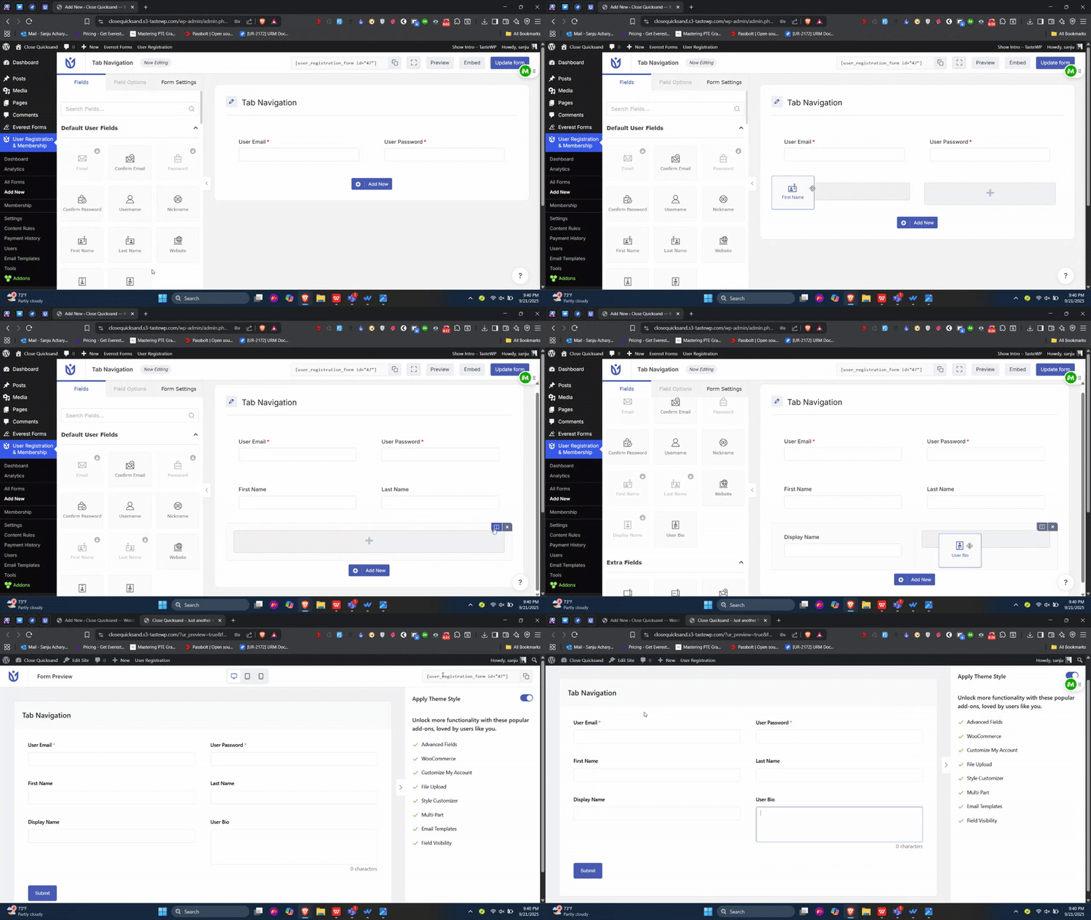
By default, when a user presses the TAB key on your registration form, the browser moves focus through fields in the order they were added to the form — not the order they appear visually in columns.
This means if you added fields to your form in a top-to-bottom sequence (e.g., First Name, Last Name, Email, Phone), the TAB key will follow that exact sequence, regardless of how they are displayed side by side in two columns.
How TAB Behaves Based on Layout
Layout Configuration | TAB Behavior |
|---|---|
Two fields per row | TAB moves left → right, then down to the next row |
More than two fields per row | TAB completes all fields in the first column before moving to the second column |
Best Practice
Use two fields per row for your two-column layout. This keeps the TAB key behavior aligned with the visual layout — moving left to right across each row before advancing to the next.
Example of correct TAB flow with two fields per row:
[ First Name ]  [ Last Name ]       ← TAB: First Name → Last Name
[ Email      ]  [ Phone     ]       ← TAB: Email → Phone
When you have more than two fields placed in the same row, TAB navigation becomes harder to predict and may confuse users who rely on keyboard navigation.
Issue 2: Mobile Field Order in Two-Column Forms
Why It Happens
On smaller screens, two-column forms automatically collapse into a single column. This is standard responsive behavior — mobile devices prioritize readability by stacking content vertically.
When this collapse happens, fields are stacked in the order they were originally added in the form builder. The visual side-by-side column arrangement is a desktop-only display — it does not affect mobile order.
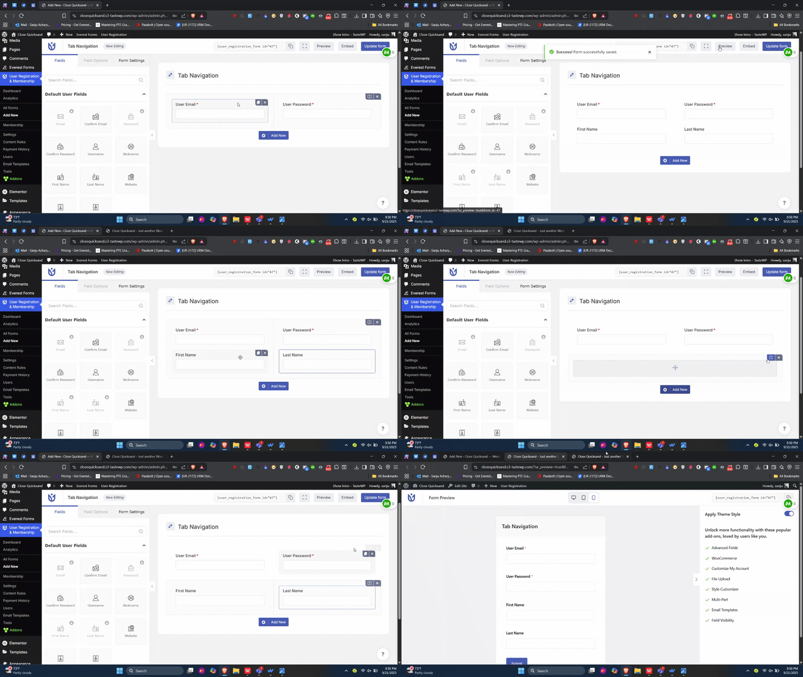
So if you added fields by column (e.g., all left-column fields first, then all right-column fields), mobile users will see all the left-column fields grouped together at the top, followed by the right-column fields below — which often creates a confusing, illogical flow.
Best Practice
Build your form with mobile field order in mind from the start:
Add fields in the top-to-bottom order you want them to appear on mobile. For example, if you want First Name and Last Name to appear together on mobile, add them one after the other in the builder before placing them side by side in two columns.
Treat columns as a visual design choice, not a field ordering tool. The column layout changes how fields look on desktop, but has no effect on the order they appear on mobile.
Preview your form on a mobile device (or use your browser's mobile preview mode) after building it to confirm the field order looks correct.
Example of recommended add order for mobile-friendly output:
Step | Field Added | Desired Mobile Position |
|---|---|---|
1 | First Name | 1st |
2 | Last Name | 2nd |
3 | Email Address | 3rd |
4 | Phone Number | 4th |
With the above order, your two-column desktop layout will display First Name and Last Name side by side in one row, and Email and Phone side by side in the next — while mobile users will see them stacked in the same logical sequence.
Quick Reference Summary
Issue | Root Cause | Solution |
|---|---|---|
TAB key skips columns or moves incorrectly | Fields were added in non-row-paired order | Use exactly two fields per row |
Mobile field order looks jumbled | Fields were added column-by-column, not row-by-row | Add fields in the order you want them on mobile |
These behaviors are not bugs — they are how browsers handle keyboard focus and how responsive CSS handles column collapse. Following the best practices above ensures a consistent, user-friendly experience across all devices.
After applying these practices, your two-column form will behave predictably for keyboard users on desktop and display in a clean, logical order for visitors on mobile. If you want to verify your changes, open the form preview and test it using both the TAB key on desktop and a mobile device or browser simulation tool.