
Advanced Analytics
Track member activity, payments, and revenue with comprehensive analytics tools for monitoring membership site performance and growth trends.
Last updated on Jul 14, 2026
The Analytics Dashboard provides a comprehensive view of how your membership site is performing. It brings together member activity, payments, subscriptions, and revenue data in one place, helping you track growth and make informed decisions.
You can view analytics for your entire site or for specific memberships, for the selected time frame.
Accessing Analytics
To access the Analytics Dashboard:
Go to User Registration & Membership → Analytics from the WordPress dashboard.
The dashboard loads with the default date range and reports.
Use the date and view controls at the top to adjust how data is displayed.
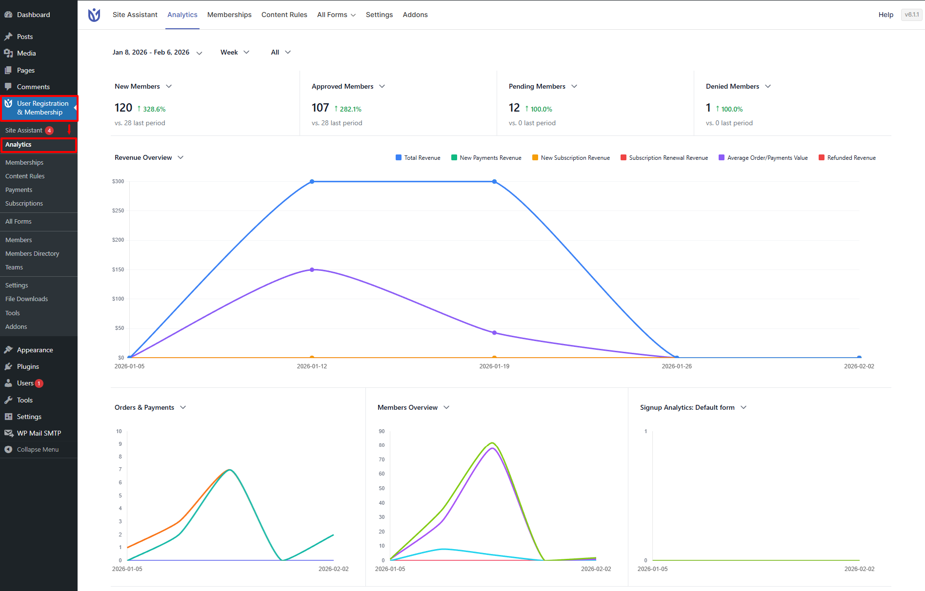
Let us check in detail about everything that’s in the Dashboard.
Date Range and View Controls
At the top of the dashboard, you can:
Select a custom date range
Switch between Daily, Weekly, or Monthly views
Compare results against the previous period
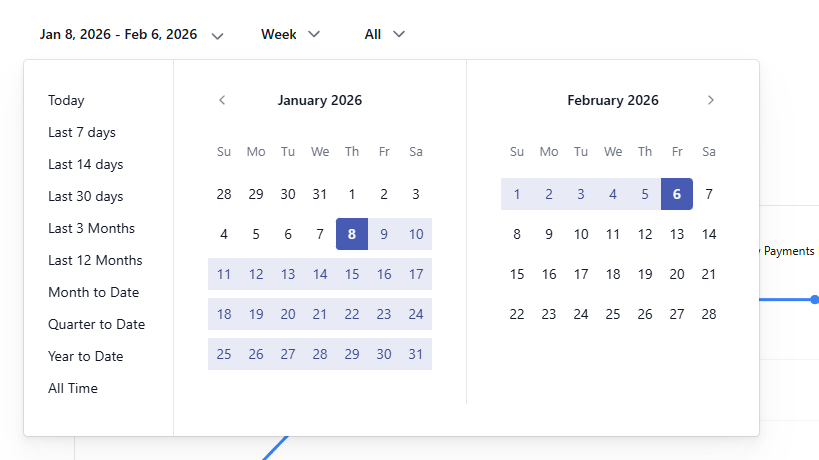
These controls help you identify trends instead of relying on isolated data points.
Membership Selection Filter
Next to the Date Range selector at the top of the Analytics Dashboard, you’ll find the Membership selection filter.
This filter allows you to analyze analytics data for:
All memberships (default view), or
A specific membership plan
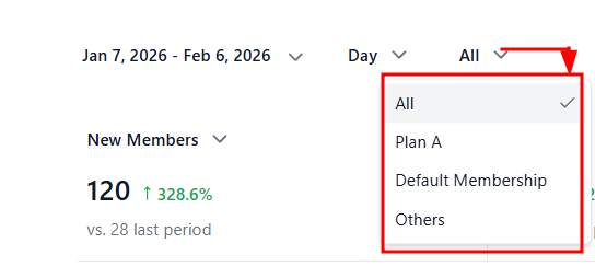
How Membership Selection Works
By default, analytics data includes all membership plans
When you select a specific membership:
All graphs and metrics update to reflect only that membership
Revenue, orders, subscriptions, and member activity are filtered accordingly
This helps you isolate performance without changing pages or reports.
Default Analytics Dashboard Layout
By default, the Analytics Dashboard displays four graphs arranged for clarity and quick analysis.
1. Revenue Overview (Primary Graph)
The Revenue Overview is the main, full-width graph displayed at the top.
It focuses on financial performance and revenue trends over time.
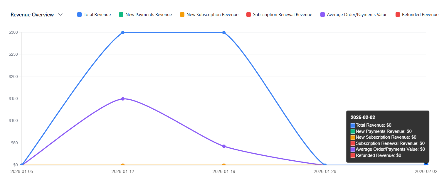
This graph provides a high-level view of your membership site’s financial performance.
2. Secondary Graphs (Same Row)
Below the Revenue Overview, there are three additional graphs displayed in a single row:
Orders & Payments
Members Overview
Signup Analytics (Form-based)
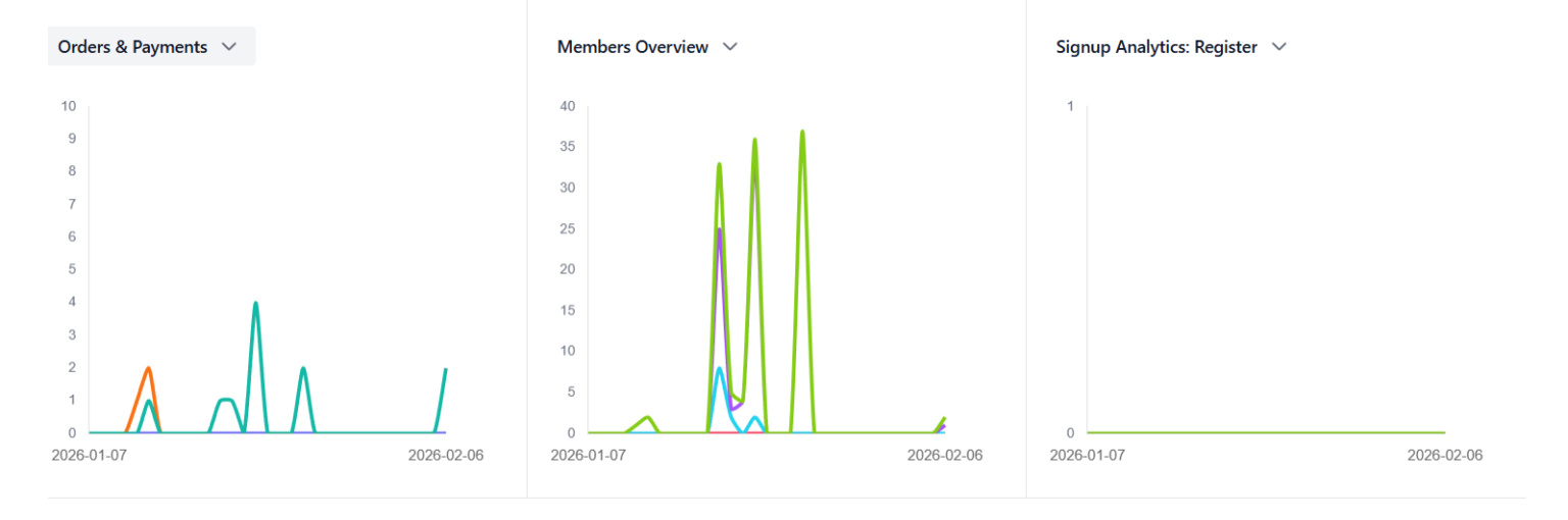
These graphs provide supporting insights into transactions, member activity, and registration performance.
Interchanging Graphs Using the Dropdown
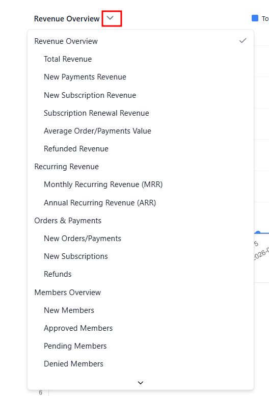
All graphs on the Analytics Dashboard are fully interchangeable.
Each graph includes a dropdown selector
You can replace any graph with another available report, including:
Revenue metrics
Orders and payments data
Membership Overview
Signup analytics for specific forms or pages
This flexibility allows you to:
Customize the dashboard based on your goals
Compare different metrics side by side
Focus on revenue, growth, or conversions without navigating away