Using the Buy Now Button Block
Add membership purchase buttons anywhere on your WordPress site to enable instant checkout for your membership plans using the Buy Now Button Block.
Last updated on Jul 14, 2026
Would you like to add a quick purchase button for your membership plans directly on any page or post? User Registration & Membership allows you to place membership purchase buttons anywhere on your site using the Buy Now Button Block.
This guide will show you how to add and customize these buttons so visitors can instantly start the checkout process for your membership plans.
Before getting started, make sure you've installed and activated the User Registration & Membership plugin on your WordPress site. Then, make sure you've created at least one membership plan that you want to sell.
Adding the Buy Now Button to Your Page
To add a Buy Now button, go to the page or post where you want the button to appear.
Click the + button in the top-left corner of the WordPress editor to open the block inserter.
Search for Membership Buy Now in the block list.
Click the block to insert it into your content.
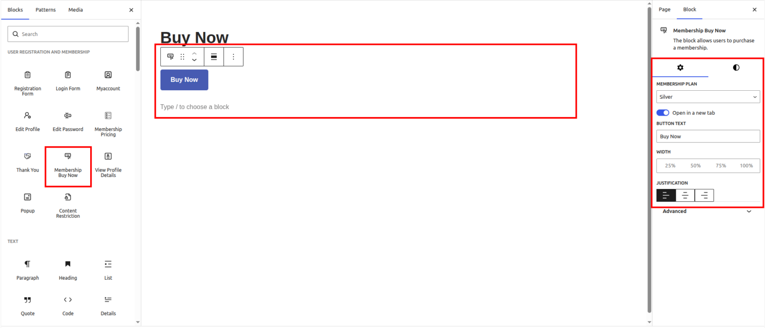
Once you've added the block, you'll see the button appear on your page with default settings. Now you can customize it to match your needs.
Selecting Your Membership Plan
After adding the block, look at the block settings panel on the right side of your screen.
In the General tab, you'll see a Membership Plan dropdown. Click this dropdown and select which membership plan you want this button to link to.
When visitors click this button, they'll be redirected directly to the checkout page for the membership plan you selected here.
Customizing the Button Text
By default, the button displays generic text like "Buy Now." You can change this to anything that fits your site.
In the block settings, find the Button Text field. Enter your custom text here—for example, "Get Access," "Upgrade to Silver," or "Join Now."
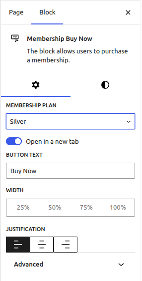
The text you enter will immediately appear on the button in the editor preview.
Adjusting Button Width and Alignment
You can control how wide the button appears and where it sits on the page.
In the block settings, find the Width option. You can choose from:
25% — Quarter width
50% — Half width
75% — Three-quarter width
100% — Full width
Next, use the Justification setting to align the button:
Left — Button aligns to the left side
Center — Button centers on the page
Right — Button aligns to the right side
These settings help you create the exact layout you need, whether you want a small centered button or a full-width call-to-action.
Choosing a Button Style
The block offers two visual styles for your button.
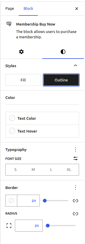
In the Styles tab of the block settings, you'll see:
Fill — Creates a solid background button with your chosen colors
Outline — Creates a bordered button with a transparent background
Select the style that best matches your site's design.
Customizing Button Colors
You can fully customize the button's appearance to match your branding.
In the Color section of the block settings, you'll find four color options:
Text Color — Changes the color of the button text
Background Color — Sets the button's background color
Text Hover Color — Changes text color when visitors hover over the button
Background Hover Color — Changes background color on hover
Click each color picker to select your preferred colors. The button preview updates in real-time as you make changes.
Adjusting Typography and Size
To change the button text size, go to the Typography section in the block settings.
You can choose from four preset sizes:
S — Small
M — Medium
L — Large
XL — Extra Large
Select the size that provides the best readability and visual impact for your design.
Configuring Border Settings
You can add or customize the button's border to create different visual effects.
In the Border section, you'll find:
Border Color — Sets the color of the button's border
Border Thickness — Controls how thick the border appears (measured in pixels)
For the Border Radius setting, enter a value in pixels to control corner roundness:
0px — Creates sharp, square corners
Higher values — Creates rounded corners (larger numbers create more rounded, pill-shaped buttons)
Opening Checkout in a New Tab
If you're adding the button to a marketing page and want visitors to stay on your main content, you can make the checkout page open in a new browser tab.
In the block settings, find the Open in New Tab toggle and turn it on.
When enabled, clicking the button opens the checkout page in a new tab, keeping your original page open in the background.