
Want to change the design and style of your registration forms? Our User Registration Style Add-on will let you do just that. With this add-on, you can easily customize each aspect of your registration to match your theme.
Installation #
In order to install the Field Visibility Add-on on your WordPress website, you will be required to follow these steps:
- First, you need to purchase the User Registration pro plugin.
- After the purchase is verified, the zip containing the addon required will be made available on your WPEverest account.
- Then, you can download the Style Customizer addon straight from your WPEverest account page.
- Finally, go ahead and install the Style Customizer addon using your WordPress admin dashboard. You can do this by visiting Plugins → Add new → Upload Plugin and uploading your download zip files.
Next, activate the installed User Registration plugin and Style Customizer add-on. And, you’re good to go!
Setup and Configuration #
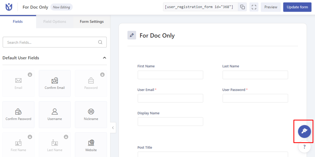
Once you complete installing the add-on, you can start setting it up. So, go to User Registration->Add New. Now, you’ll see a Form Designer button on the bottom-right of the form builder. After you add the required form fields for your registration form, you can click on the Form Designer button to start customizing the form style.
Style Customizing Options #
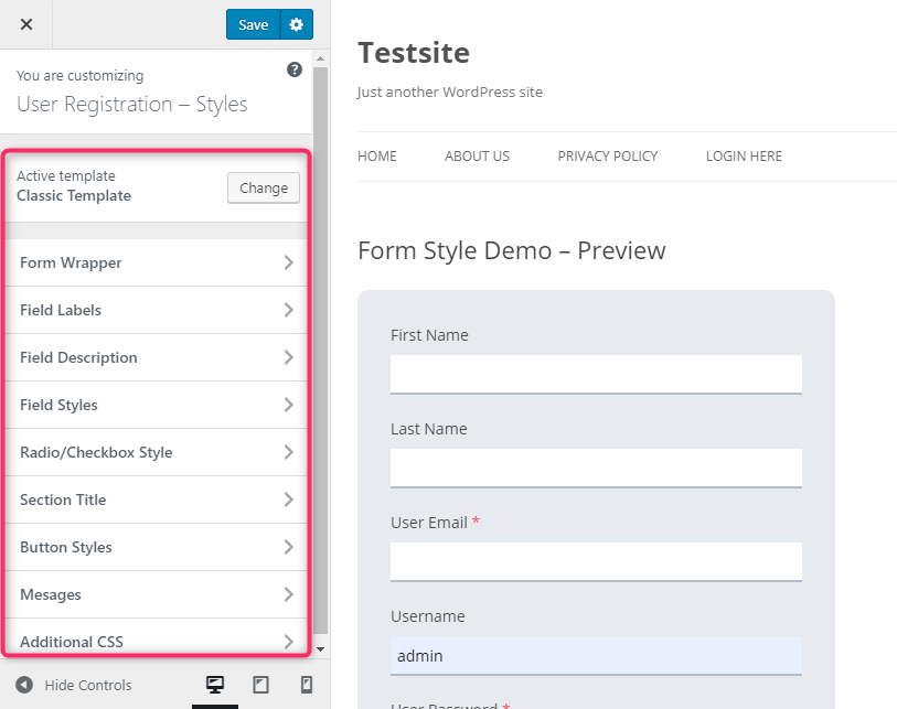
After you click on the button, you’ll be taken to the customizing panel. There are basically 10 sections that you can change on your website.
However, the texts and the numbers of the form cannot be edited using the addon. Only the style of the components of the form can be changed with the help of this addon. The following sections of your form can be edited as you desire:
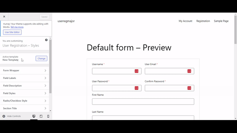
1. Active Template #
This is one of the major customizable options of the addon. The Active Template allows you to change the overall layout of the form. Here, you can choose between the Default and Classic Template or create your own custom templates.
2. Form Wrapper #

The Form Wrapper resembles the total outline and the background of the form. The options that can be configured from here are:
- Form Width
- Font Family
- Background Color
- Border Type
- Border Width
- Border Color
- Border Radius
- Form Margin
- Form Padding
3. Field Labels #
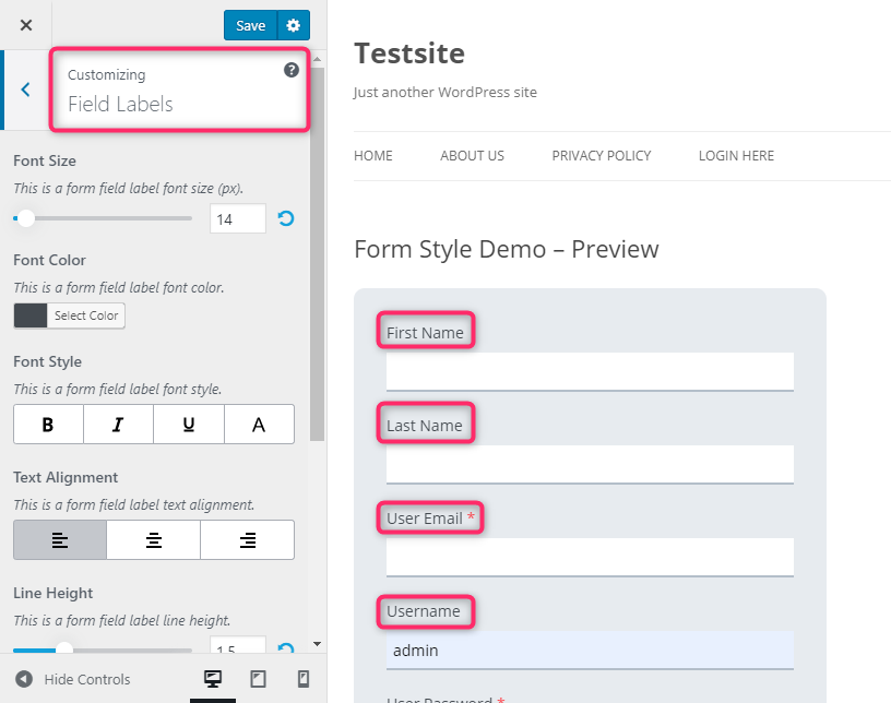
The Field Labels refers to the labels and the descriptions provided for the form fields. The following settings can be enabled or changed in this section:
- Font Size
- Font Color
- Font Style
- Text Alignment
- Line Height
- Margin
- Padding
4. Field Description #
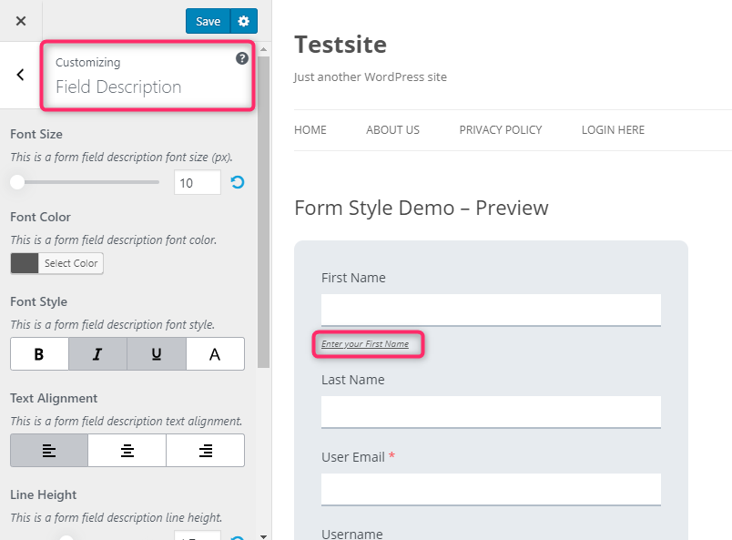
The description provided to describe each of the form fields can be customized in this section. The following options are enabled for it:
- Font Size
- Font Color
- Font Style
- Text Alignment
- Line Height
- Margin
- Padding
5. Field Styles #
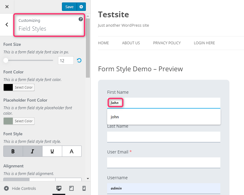
The description or the field data provided by the users to the form fields can be edited in this section. The options enabled for customization in this section are as follows:
- Font Size
- Font Color
- Placeholder Font Color
- Font Style
- Alignment
- Border Type
- Border Width
- Border Color
- Border Focus Color
- Border Radius
- Background Color
- Field Margin
- Field Padding
6. Radio/Checkbox Style #
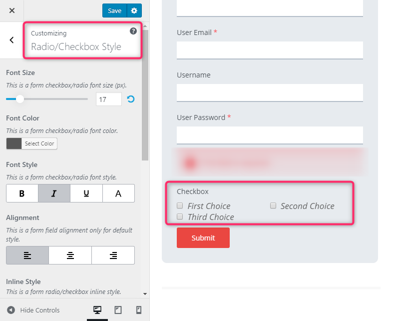
This section refers to the different type of texts, numbers, or symbols used for the checkboxes or the radio buttons. The following options are available in this section:
- Font Size
- Font Color
- Font Style
- Alignment
- Inline Style
- Style Variation
- Radio/Checkbox Color
- Form Margin
- Form Padding
7. Section Title #
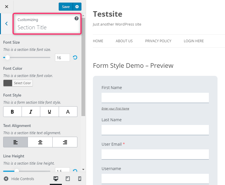
This section introduces the customizations for the section titles. The options enabled in this section are as follows:
- Font Size
- Font Color
- Font Style
- Text Alignment
- Line Height
- Form Margin
- Form Padding
8. Button Styles #
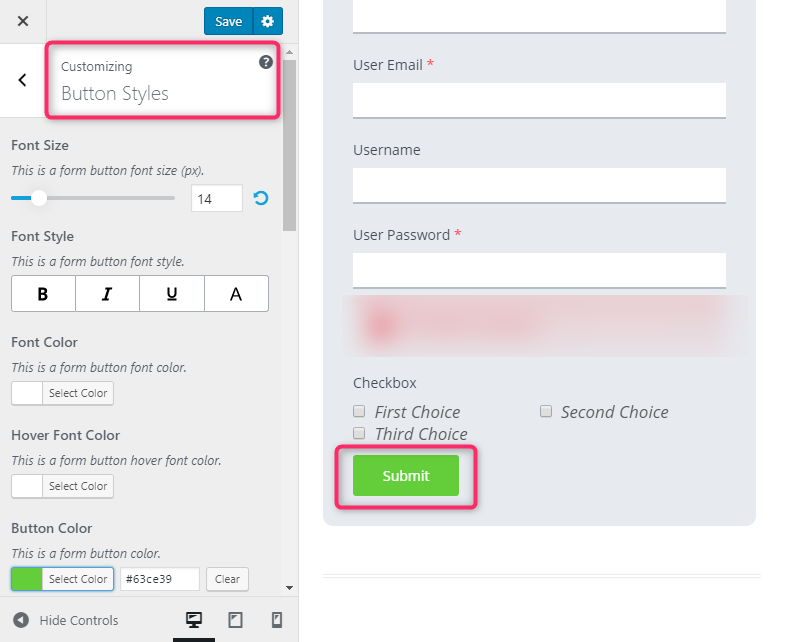
The Button Styles are the various styles for the different buttons used on your form. The options for it are:
- Font Size
- Font Style
- Font Color
- Hover Font Color
- Button Color
- Button Hover Color
- Button Alignment
- Border Type
- Border Width
- Border Color
- Border Hover Color
- Border Radius
- Line Height
- Button Margin
- Button Padding
9. Messages #
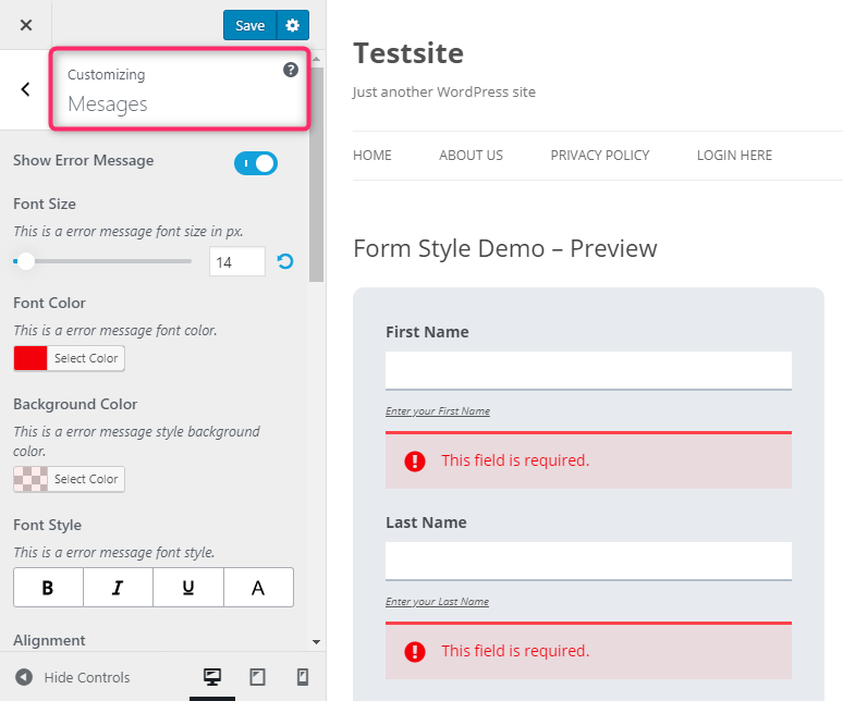
In the Messages styling tab, you get two options: Show Error Message and Show Success Message. You can enable them to show the error and success message of each form field. And, you can change the styling settings for both messages. The styling options are:
- Font Size
- Font Color
- Background Color
- Font Style
- Alignment
- Border Type
- Border Width
- Border Color
- Border Radius
- Line Height
- Field Margin
- Field Padding
10. Additional CSS #
As the name suggests itself, Additional CSS can be used to to add your own CSS codes to customize your registration form the way you want. You can see an CSS editor in the customizer where you can add all the CSS codes you want.
Customize Login Form #
You can customize the login form too using the Style Customizer add-on. All the settings that you went through above are also available for the login form too.
To access the login form customizer, click on User Registration > Settings > Login Options > Customize Login Form


